menu bar 10 menu bar 2 menu bar 3 menu bar 4 menu bar 11menu bar 5 menu bar 6
Showing posts with label design. Show all posts

Tuesday, May 13, 2014

Copper and Gold Foil Stationery

After introducing gold foil pressed cards into my shop several months ago, the creative wheels began to turn as I thought of all the beautiful foiled stationery that I could create. While the hot foil press seemed to be an easy shoo-in for foil stationery, it came with many limitations that began to irritate me. I could only press paper with letter type that was sized small enough for my press, and I couldn't really use my own designs.

With these limitations in mind, I began looking into the process of foil embossing and printing without the use of the hot foil press. I spent many hours completing test runs, and finally felt confident with the results. I have since debuted two new designs in my shop-- a beautifully simple stationery set printed in copper paired with aqua envelopes, and a gold foiled hello card sweetly paired with light pink.

https://www.etsy.com/listing/189344610/copper-foil-arrow-stationery?ref=shop_home_active_11
https://www.etsy.com/listing/189347281/hello-gold-foil-card-card-for-a-friend?ref=shop_home_active_12
I'm thrilled with how my original visions for these designs have come to life on paper, and look forward to adding more foiled paper products in the near future.

Do you like the foil look? Do you prefer foil on stationery or art prints?

Monday, June 17, 2013

Modern and Geometric Note Cards

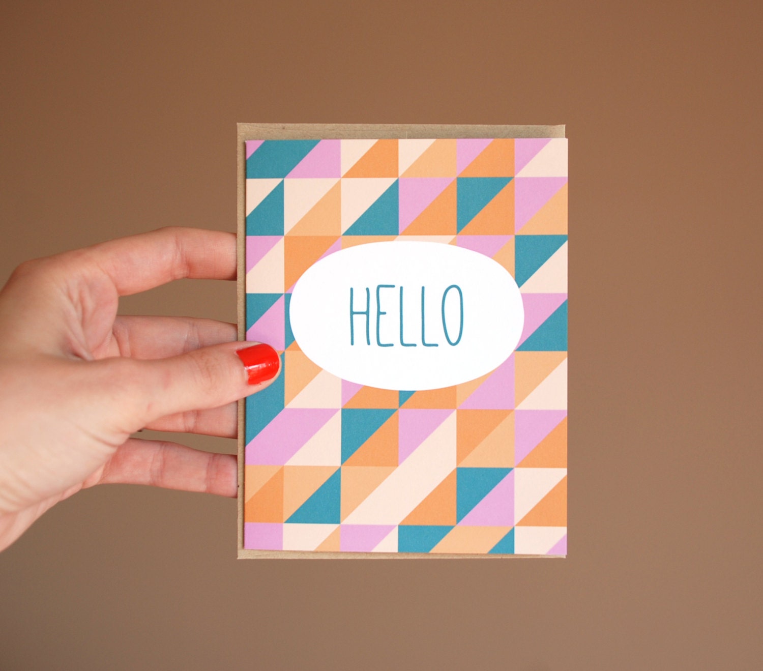
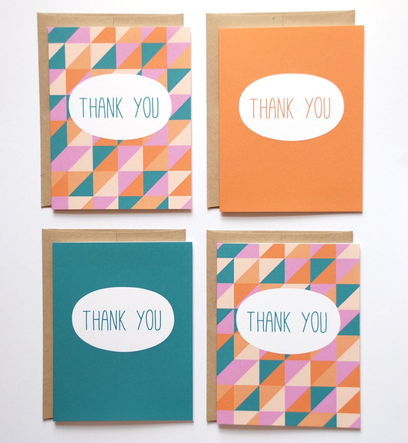
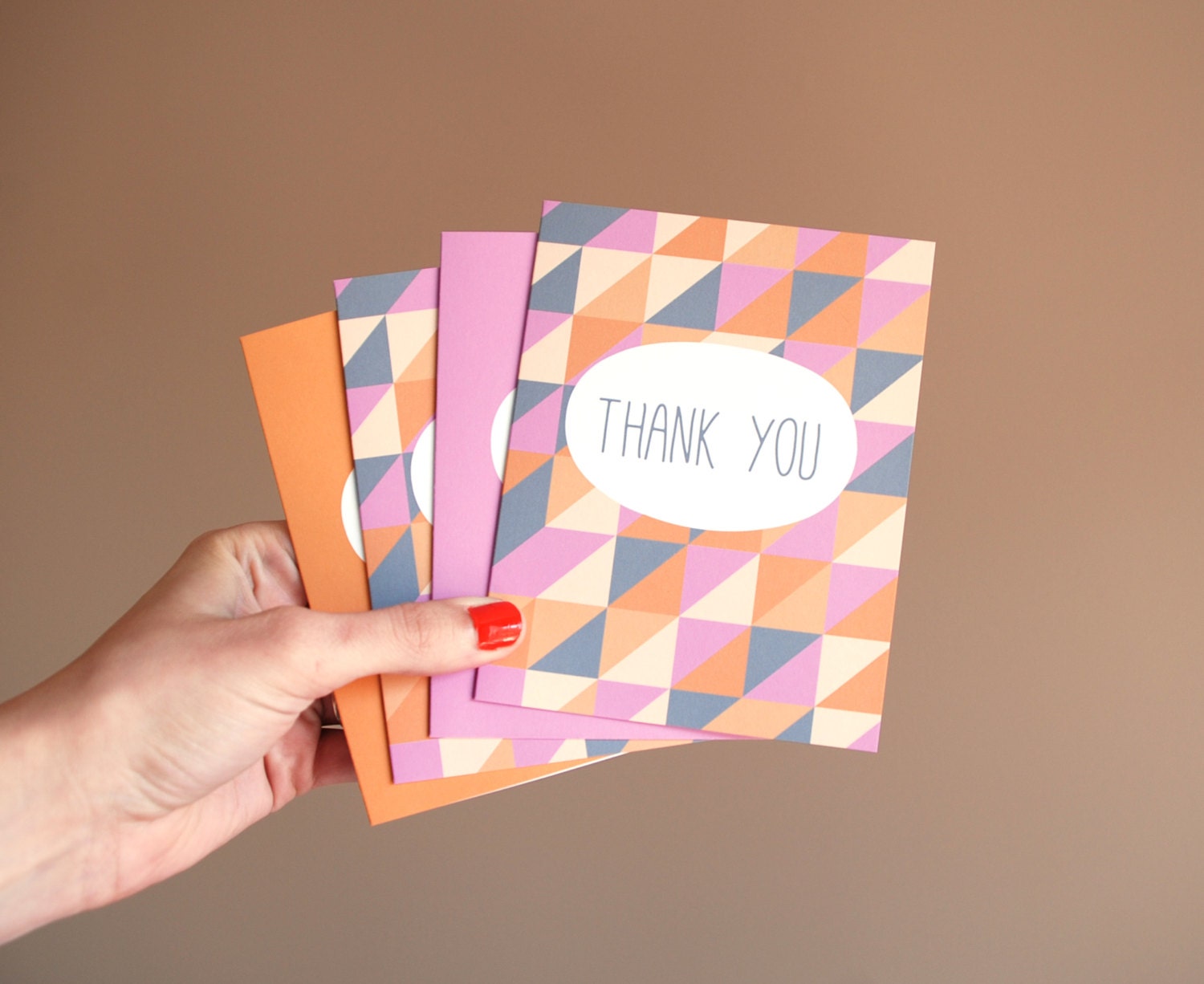
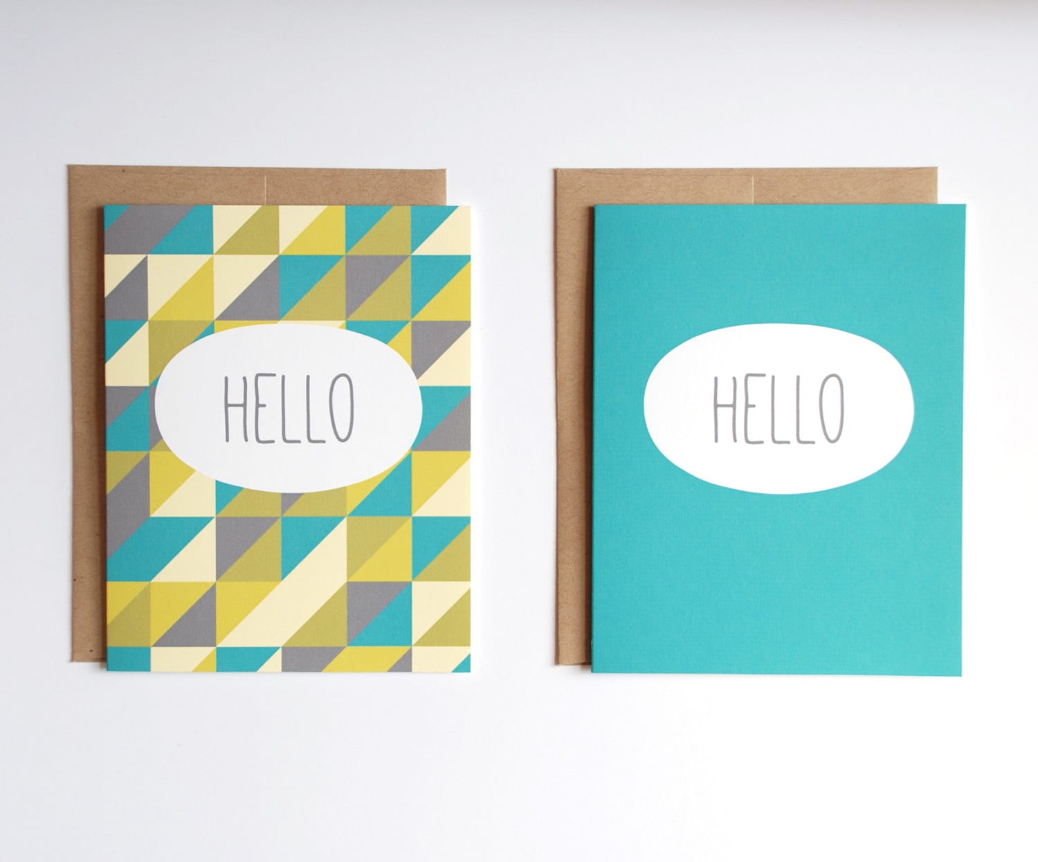
If you're following me on Instagram or Facebook, then you'll already know just how obsessed I am with a new line of cards that I've been working on and slowly releasing in the shop. Inspired by a few conversations about geometric patterns with my friend Kristen, I decided to play with triangles in bold colors. This isn't the first time I've used this concept and you can see my first take on triangles and stationery here. But I wanted to try something that had even more of a pop. The result is a line of thank you and hello note cards in three different color schemes that will all soon be available in both single greeting cards and sets of four with accented solid colored cards. Each card has been paired with 100% recycled Speckletone Kraft envelopes from French Paper Co.-- my favorite! The quality of these cards as a whole does not get any better.

These cards are currently already in the shop with the rest to soon follow. I love how each color schemed turned out, and I continue to indecisively move from one to the other as my favorite. It is an amazing feeling to have something turn out just as you had envisioned in your head, and this is truly one of those types of projects.

What do you think of the new line? Are you obsessed with the current fad of bold colored and modern triangles like me?

Tuesday, April 30, 2013

Pen and Paper

Last week I finally had some time to sit down and just draw. I felt as though I hadn't been able to do that for years. I know that's an exaggeration, but I really hadn't had much time to do anything related to design. I sort of felt as though I was finally getting back to my roots. It was like I was that four year old girl again with a brand new set of markers she got for Christmas, getting busted by her mom at 4am after she was so excited to use them she decided to climb out of bed, turn the bedroom light on, and start drawing.

Never underestimate the exhilaration a stack of blank paper and a drawing pen can generate.

On the other hand, drawing is also relaxing. That pen and paper gave me a chance to forget about my school day and do something that had no rules. After being in an institutional environment for a long week, something about playing outside those bounds is freeing.

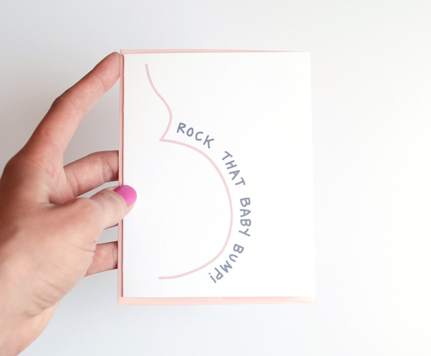
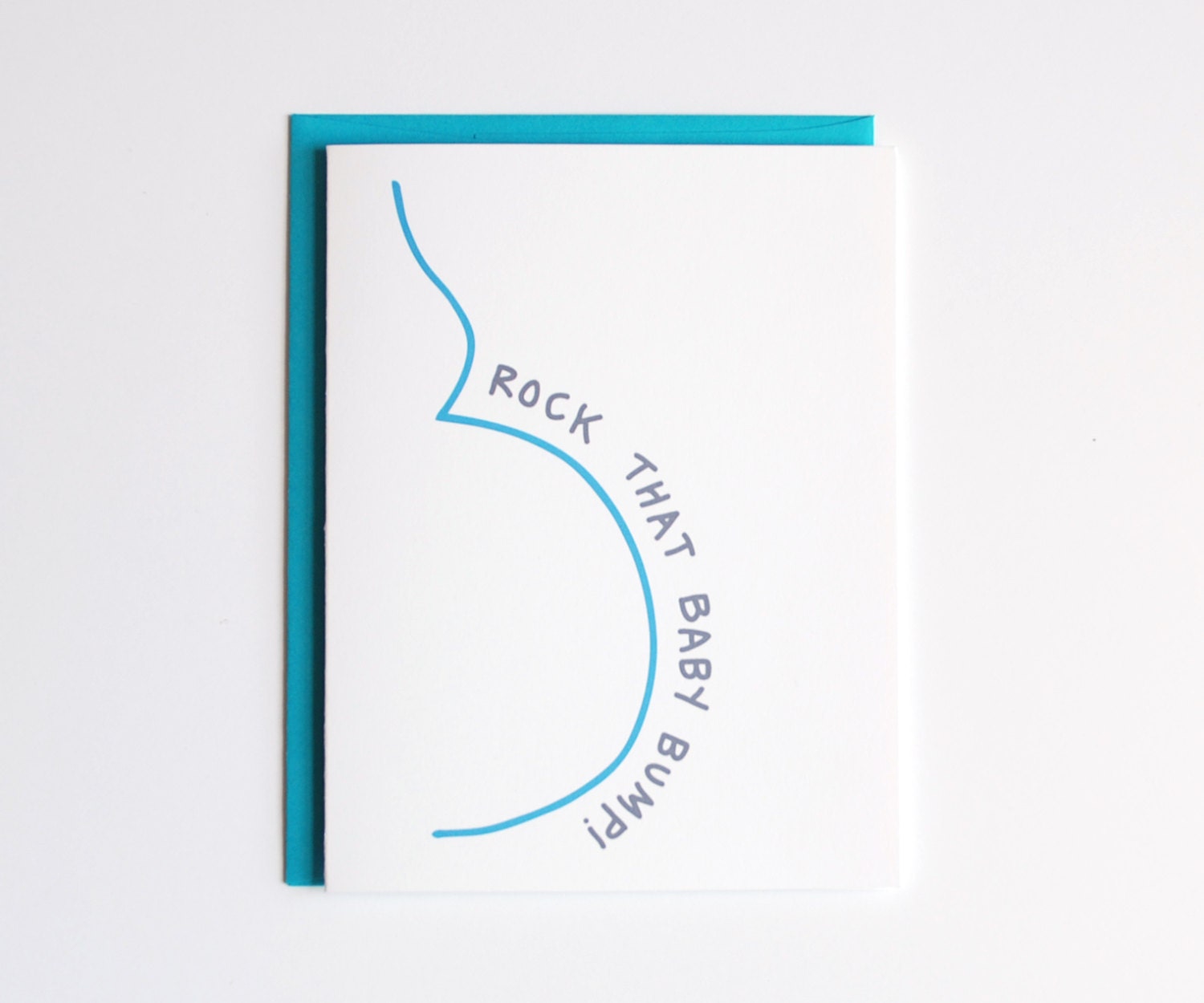
I took all of my doodles and used them for several new card designs. Here are the end results.


I love how the baby bump cards turned out-- super simple and fun! Which is your favorite?

In other news, I'm going to try blogging more regularly again. Jenni came up with these fantastic blog post ideas for the month of May that are quite inspiring. I may not be able to follow along for the whole month, but I'm going to try!

Monday, April 22, 2013

Blogging Break and a Woot Woot!

If blogger was my first job description, I would suck at life. I took some advice Gina gave me to heart recently when I realized how tired I was. I cut out blogging. The reality of the situation is that I haven't stopped in the past several weeks. Last weekend was chaotic with little sleep as I took part in my first large craft show. This past weekend my best friend from college was in town not to mention about five million other things that were going on all in one weekend. Needless to say, something had to go. Blogging was the easiest thing to take out of the equation. I still will probably not be back here on my blog as regularly as I had been until the school year comes to a close.

This weekend I got to really see how all of my hard work paid off! Urban Outfitters finally listed my card on their website.

In addition, after taking in an Orioles game with friends on Sunday afternoon, we stopped in at the Urban Outfitters in the Inner Harbor and got to see the card in their store in person!
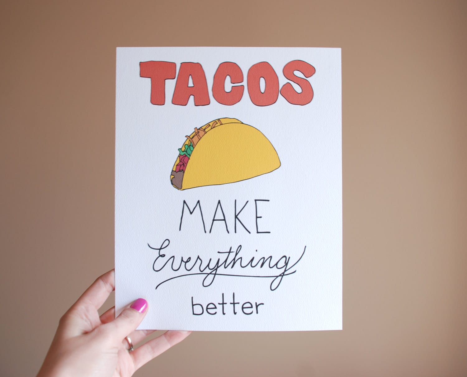
Definitely exciting! Also exciting? The taco print is now in the shop. Booya!
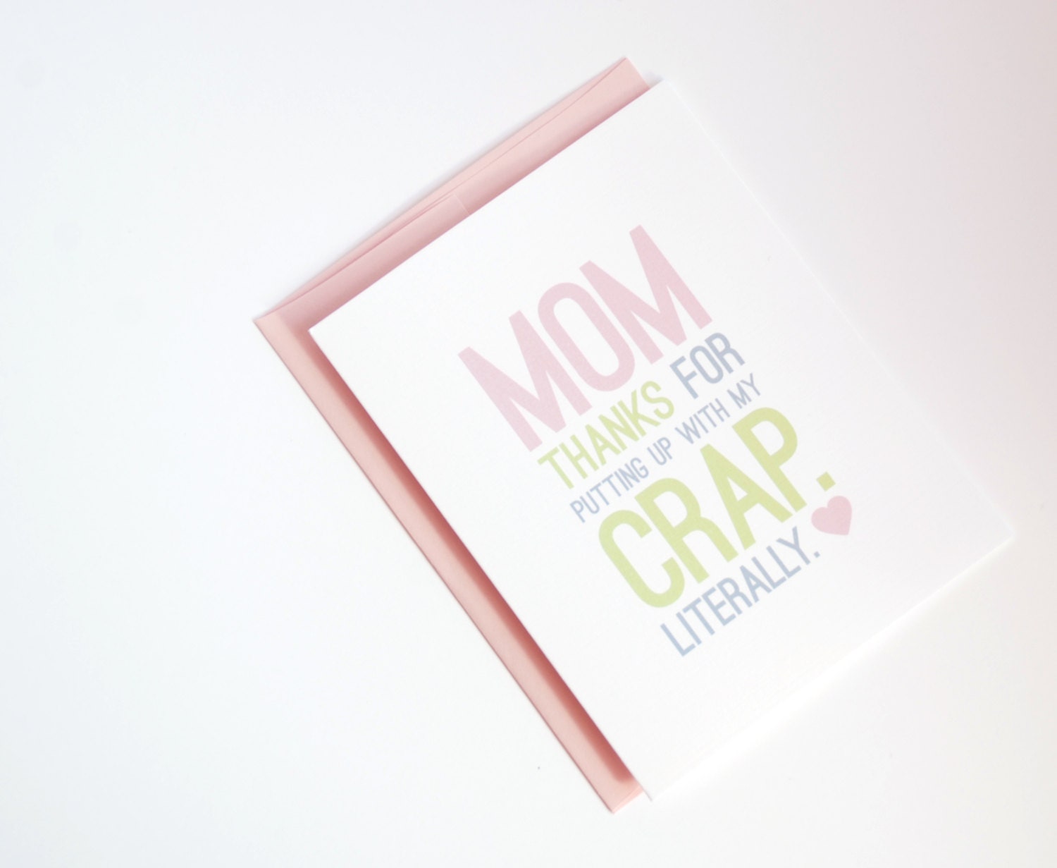
Also, for those of you that love this Mother's Day card,
but wished that it was a Father's Day card, your wish has come true.
You're welcome. Now, how have you all been? I feel as though I am out of the loop!

Saturday, November 17, 2012

Graphic

There are days when I love a really fabulously put together outfit (most days, in fact). But there are also days when I like to throw on a t-shirt and call it a day. I don't like to throw on any old t-shirt though-- it has to have a good graphic. For a while my go-to graphic tees were ones that I picked up at concerts. It just seems that a lot of the bands I like also have a great art department when it comes to their merchandise. Umphrey's McGee was practically my t-shirt supplier for a while and these are some of my favorites of theirs that are camping out in my closet.
via
via
My favorite one of all is MIA on the interwebs and is scuzzy enough at this point that I shouldn't model it for you, but it is a super soft gray shirt with a tour van driving down the road into the Rocky Mountains. If I could find a new version of this one, I would be the happiest girl in the world. (Attention to the rare t-shirt finding gods-- start doing your magic so that I can find one these!!) Most comfortable t-shirt ever. I do not lie.

John Butler Trio also has found some space in my closet with some pretty awesome tees. My favorite of all is this super soft dark grey tee. I would replace it if I could, but unfortunately it only comes in extra extra small right now (I didn't even know that was a size!).

via
Needless to say, I've been looking to add a few new t-shirts to my closet for that Saturday afternoon when you don't feel like wearing anything special. I ended up finding a few that I really like that might work as good replacements for the ones that have seen better days.

Maybe this JBT shirt will suit as a good replacement for my original one.

via
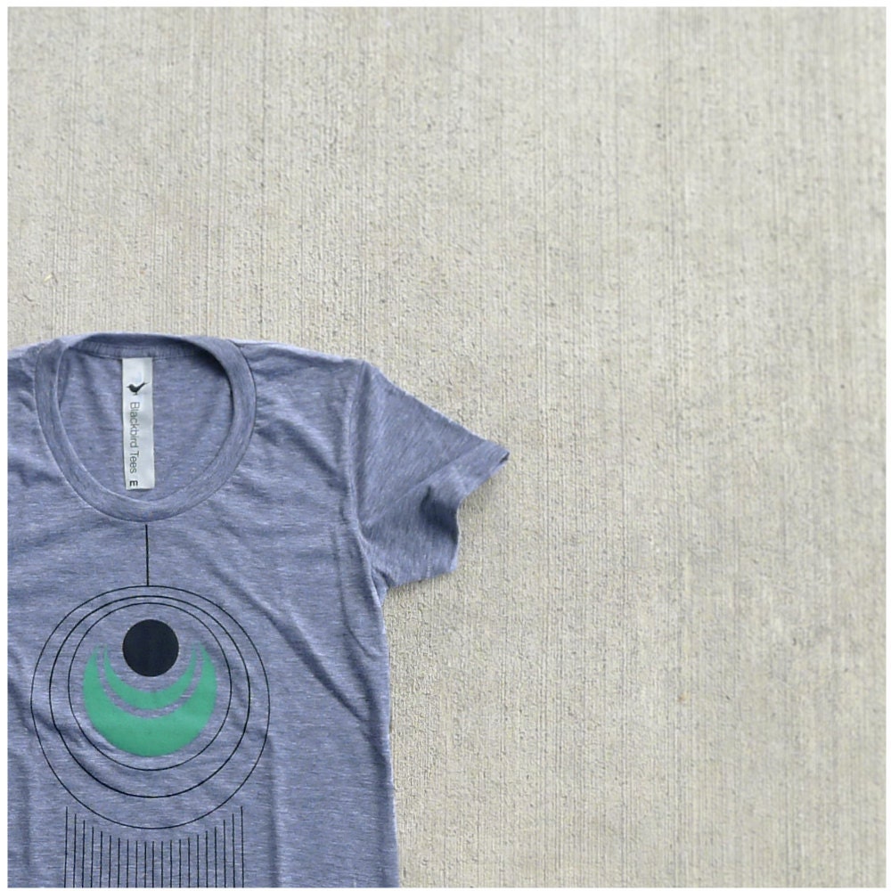
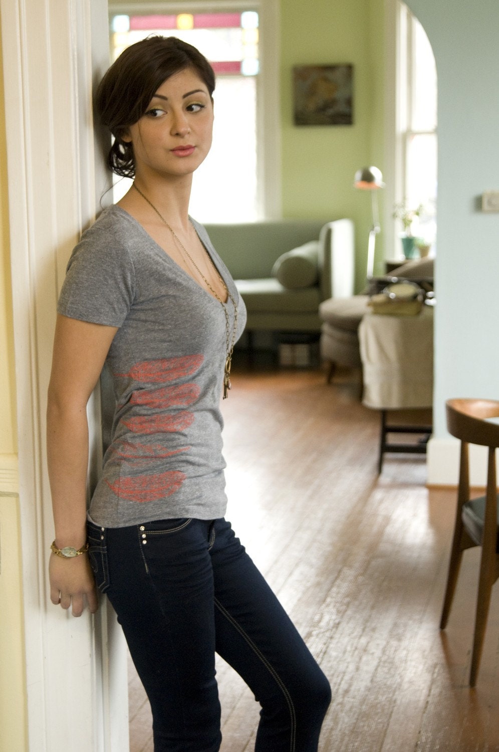
Love this tail feather tee from Blackbird Tees.


These five feathers printed on the side of a v-neck are fabulous! I love a good v-neck-- I'm a huge fan over the crew neck (v-necks are just way more flattering on me) and She-She seems to have mastered a great graphic tee.

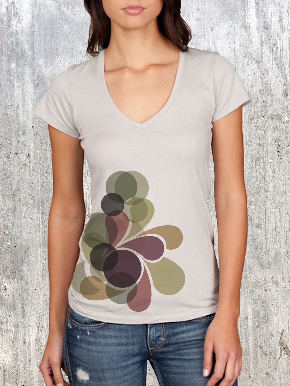
Love the neutral tee and complimentary graphics on this organic shape collage tee from Crawlspace Studios.
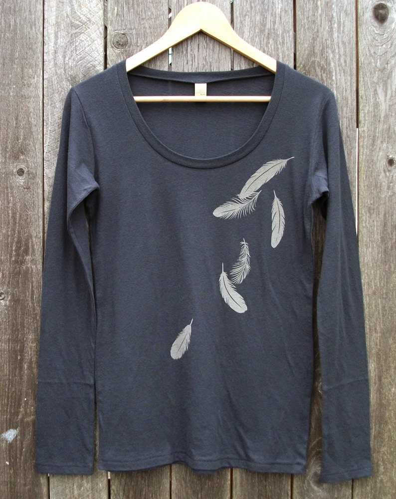
And Uzura provides a great option with this long-sleeved feather tee.
What does your lazy Saturday wardrobe look like? Do you have any tees that you just can't rid of no matter how worn out they are? Or maybe I'm just the crazy one in that department. ;)

Sunday, October 21, 2012

Bold Colors Paired in Simple Ways

Over the years there is one thing that many paper lovers will acquire, and that is overabundance of the thing we love. It would be a lie if I were to say that I don't have paper spilling out of drawers and taking over my studio. Paper can be inspiring. Sometimes I need to buy new paper in order to get my creativity going again. However, the result can be too much paper.

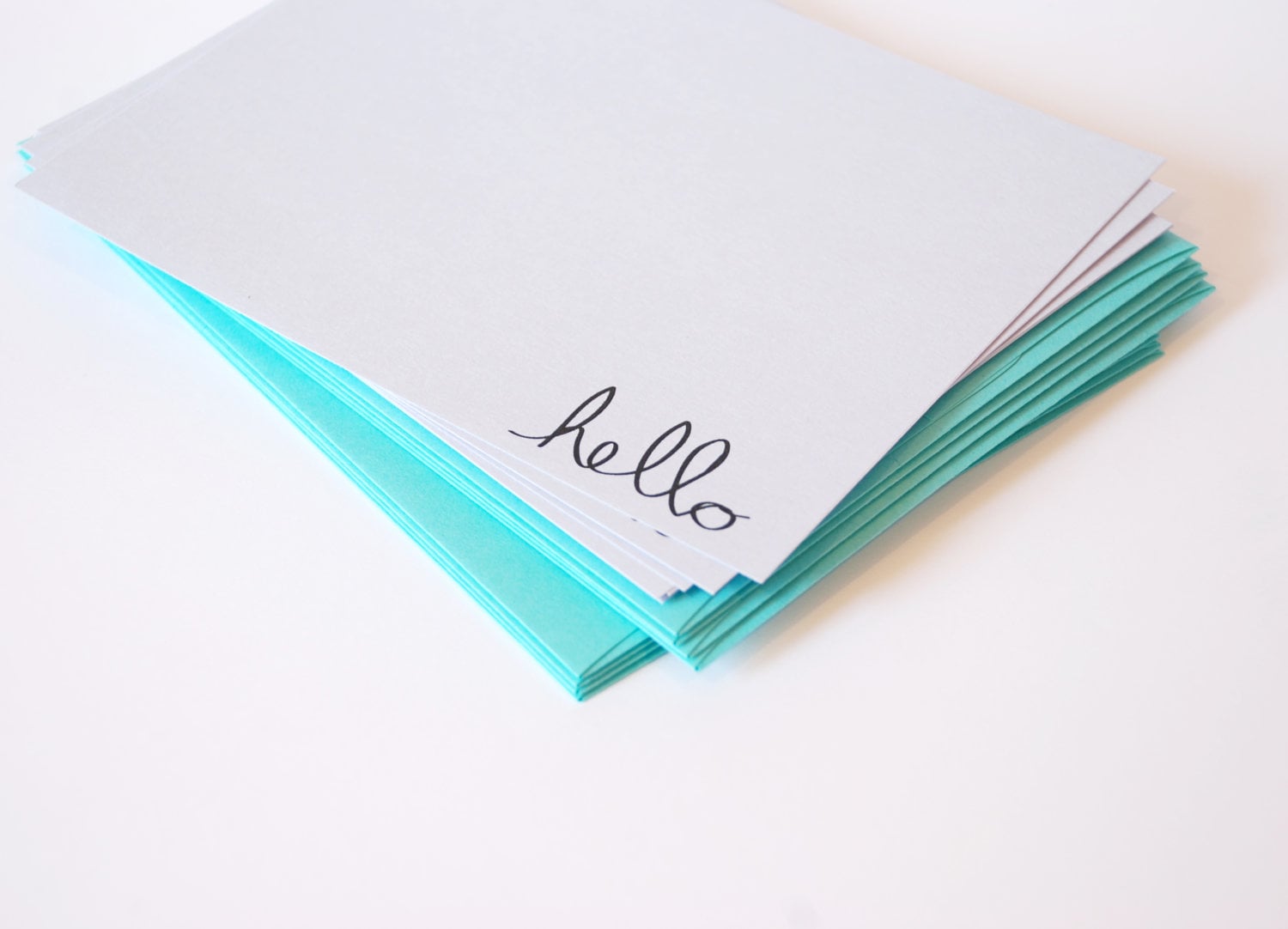
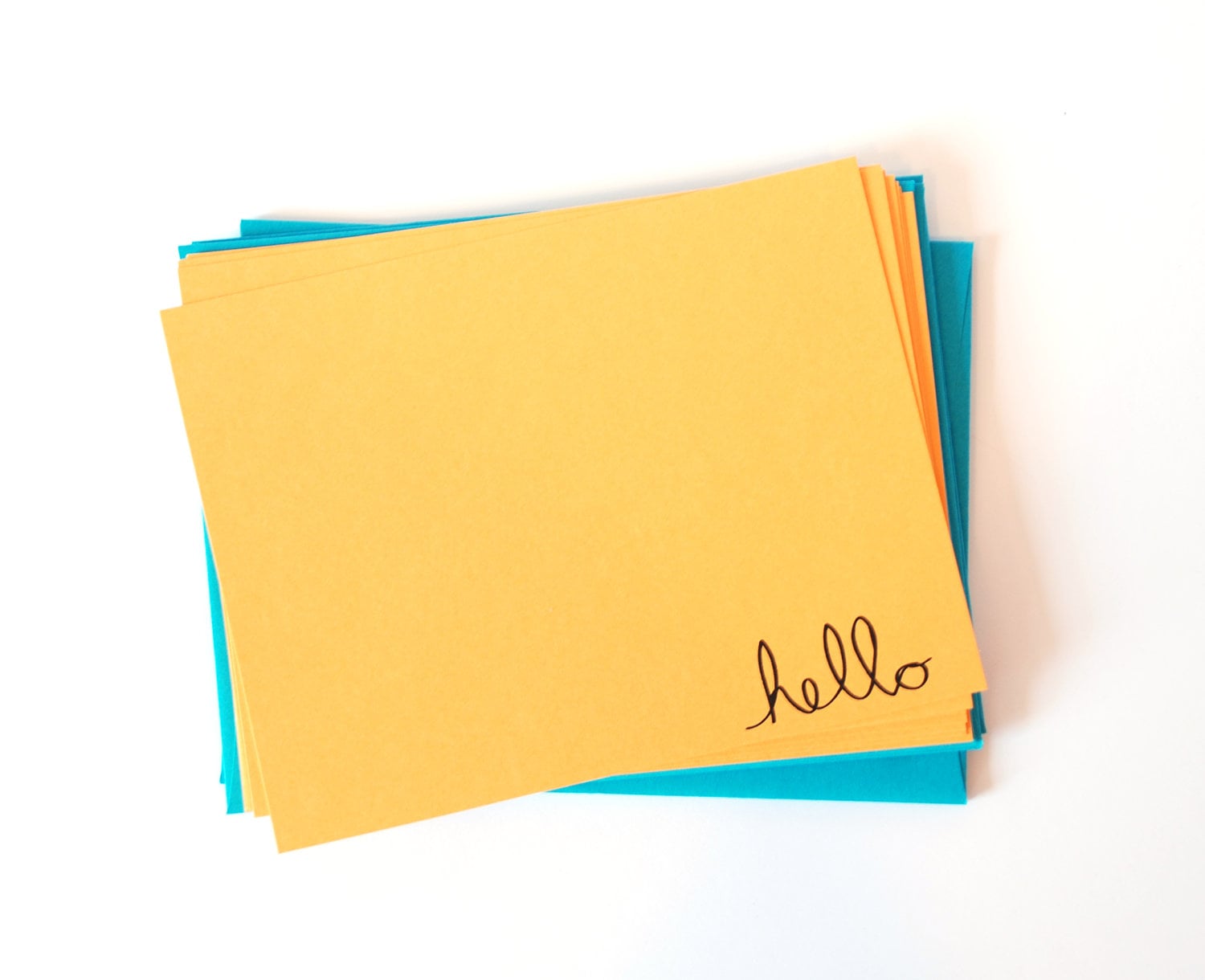
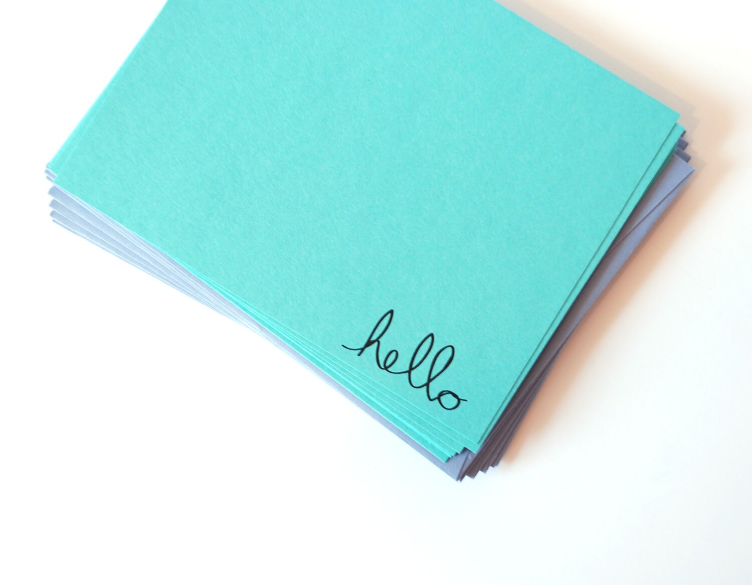
Last weekend, I spent part of the morning reorganizing my drawers full of paper when I suddenly thought of a fun way to both minimize my stock in paper and provide an economical set of correspondence for my customers. I paired bright colored card stock with contrasting envelopes. I cut flat note cards from light-weight 80lb card stock and printed each card with a handwritten hello. The end result? Bright, fun, and bold flat notes for the economically minded. Right now there are three limited edition sets of 8 flat notes available in the shop, and each set is only $10. And I have a few more color combos in mind. These cards would be perfect for a simple note to a friend-- nothing too fancy, but a blast of color to brighten someone's day.


I think I'll even start using these for myself to send a little cheer to my family and friends. Sometimes the simplicity of color is all that we need.

Friday, October 19, 2012

An Update

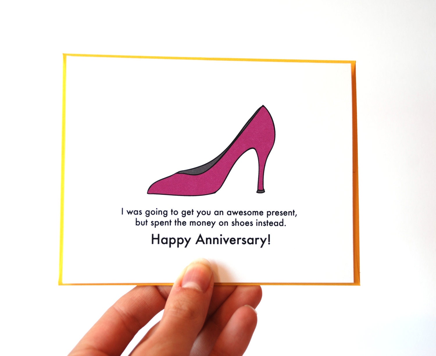
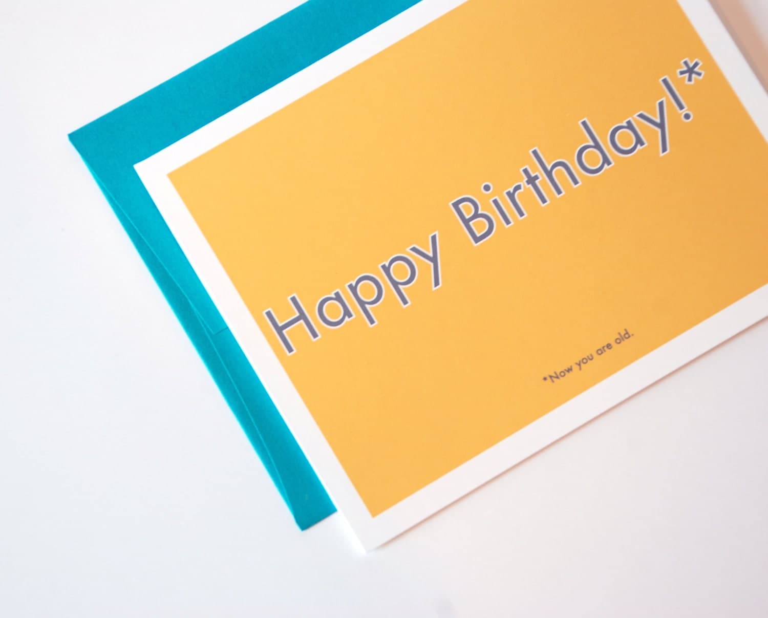
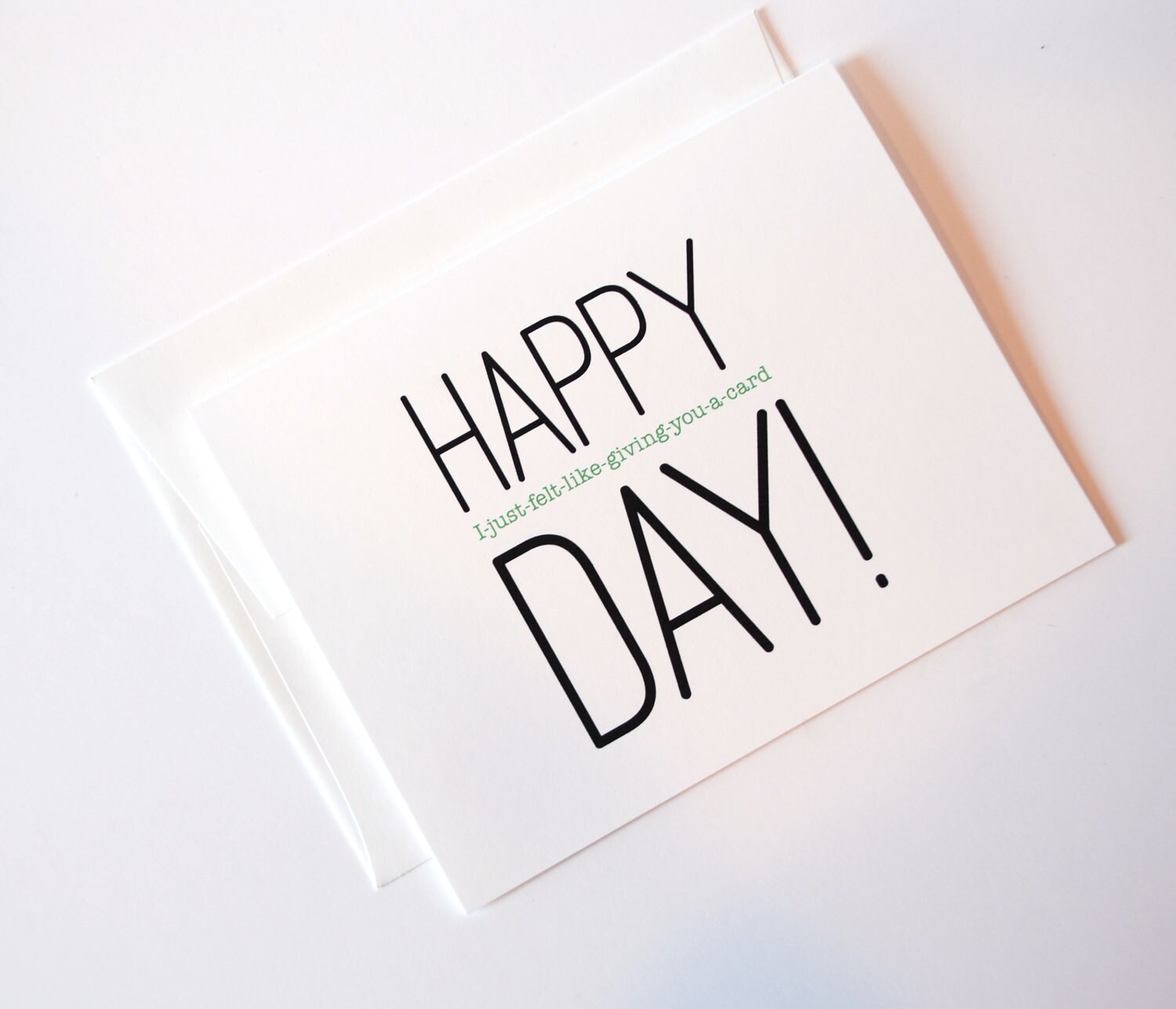
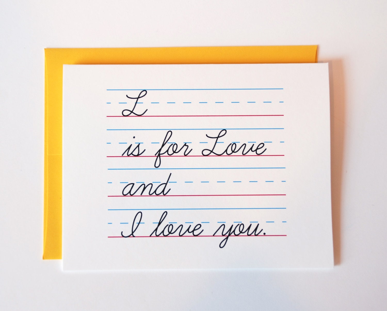
I've been trying to do better with updating this dear old blog more frequently. I was a self-proclaimed success after a post on Monday and Tuesday. Two days in a row-- success indeed! I've also been super busy with new designs and trying to get them into the shop. I spent a larger portion of last weekend printing, editing, and photographing some of my latest cards. I feel as though I've had a plethora of creative ideas, but having the time to get the final product into the shop has been a challenge. In addition, to a few new items that I wanted to share today, I have some new holiday cards and Thanksgiving cards that will soon be listed as well. But for now, I'll share with you some of my newest favorites.


My latest anniversary card may or may not be from similar personal experience.


I love the fine print on this one. Not going to lie-- I may have felt a little old this year on my birthday. Only one year away from the big 3-0 is kind of crazy!


A few people suggested that I make some fun cards with no occasion in mind. This is one of my favorites as a result of that suggestion.


I love the simplicity of this love card. Reminds me of those grade school crushes.

What creative endeavors have you been working on lately?

Saturday, October 13, 2012

StarSeventeen

You may or may not remember my little feature of StarSeventeen, my sister's Etsy shop. Recently, my sister asked me to work on a branding concept for her shop. I was super excited to do this because it is something I've been interested in dabbling in for a while. And of course I was super excited to be helping out my sister! She is an extremely talented artist, so for her to ask me to design something for her was quite the task.

Her art focus of choice these days happen to be painted hats such as these.


She wanted a logo that represented both her signature "portal design" (as you see in this hat) as well as an urban retro feel. The end result?


In addition to the logo, I created a banner for her facebook page and her Etsy shop. My last job was to make post cards, merchandise tags, and business cards for her as well. Everything turned out just as I had envisioned and my sister was by far the easiest client I have ever worked with. Maybe it had something to do with the fact that we have ESP. And by ESP, I mean, that I'm familiar enough with her art that I could run with the suggestions she gave me.

Anyway, be on the look out for lots of new super awesome stuff in my sister's shop that goes beyond just the hats! She also just started up a new blog, so feel free to show her some love there as well! And to any of you looking for some design work, I may or may not be just a little happy if you ask me work on a new logo for you. ;)

Any new projects or concepts that you've been working on lately?

Wednesday, July 18, 2012

Holy Cards, Batman!

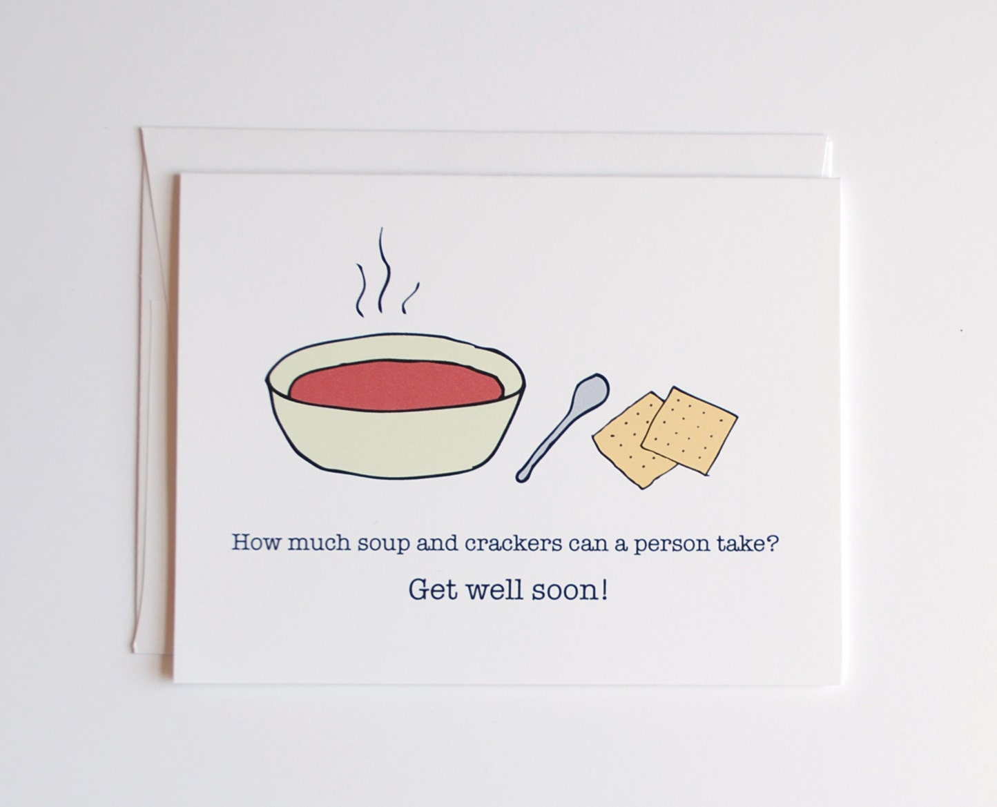
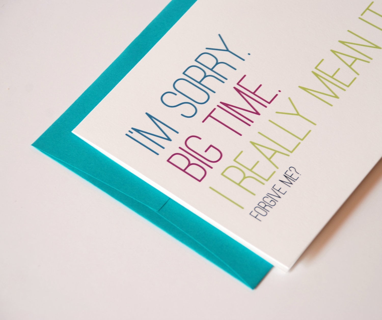
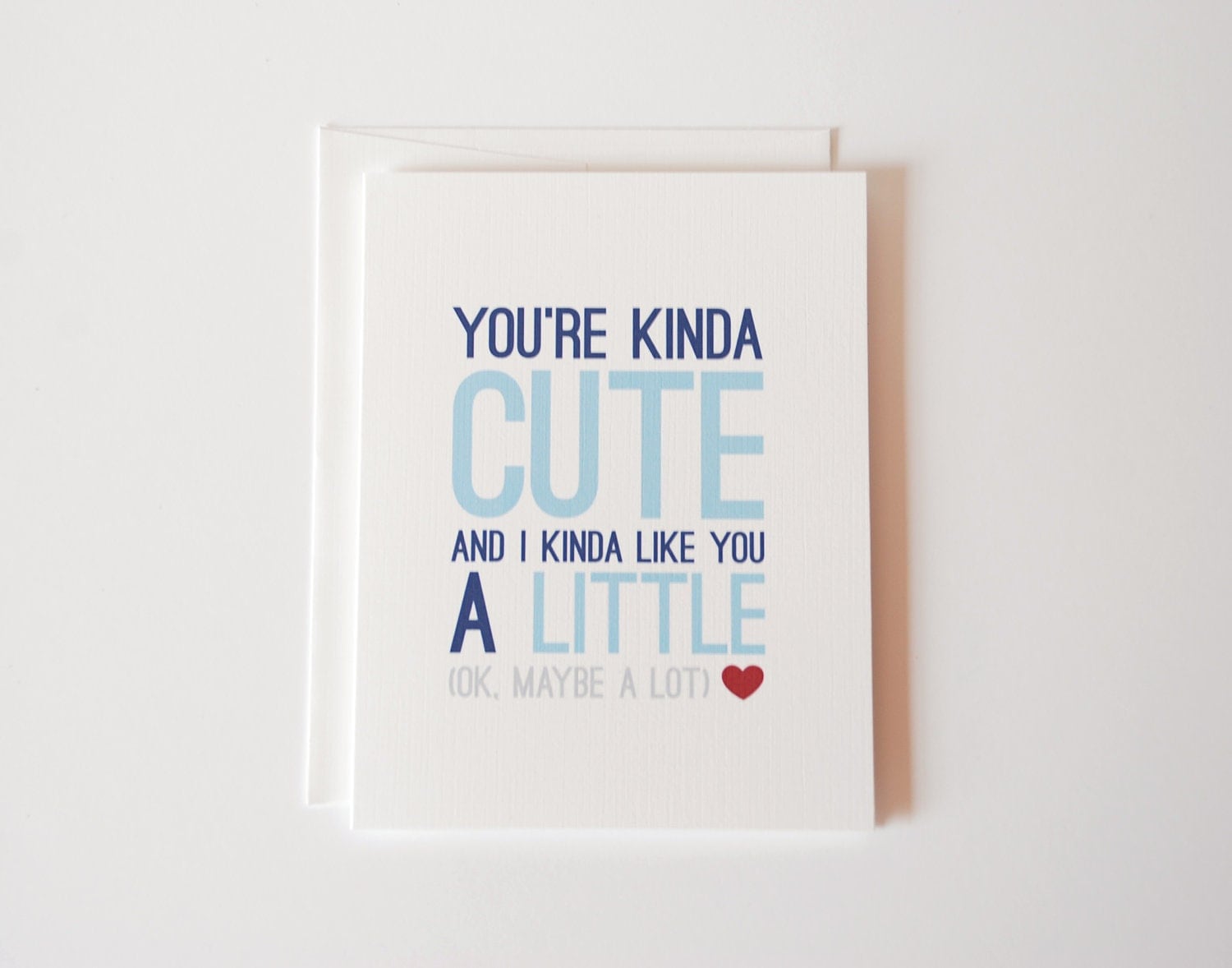
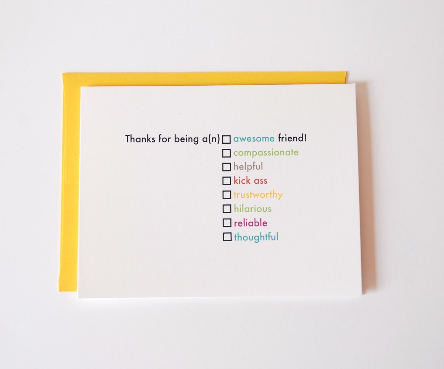
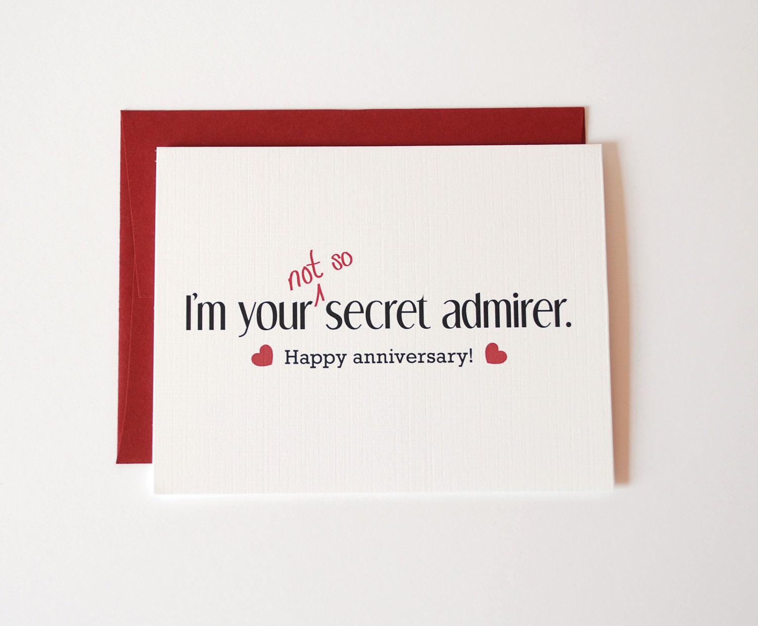
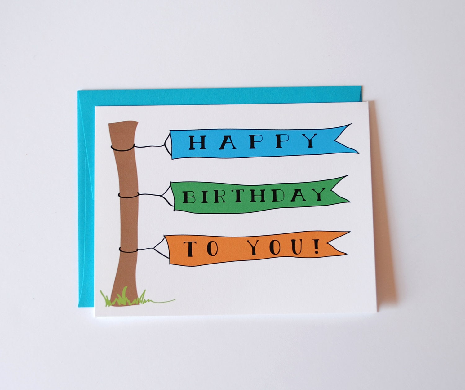
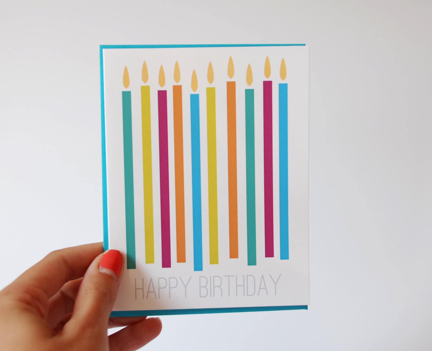
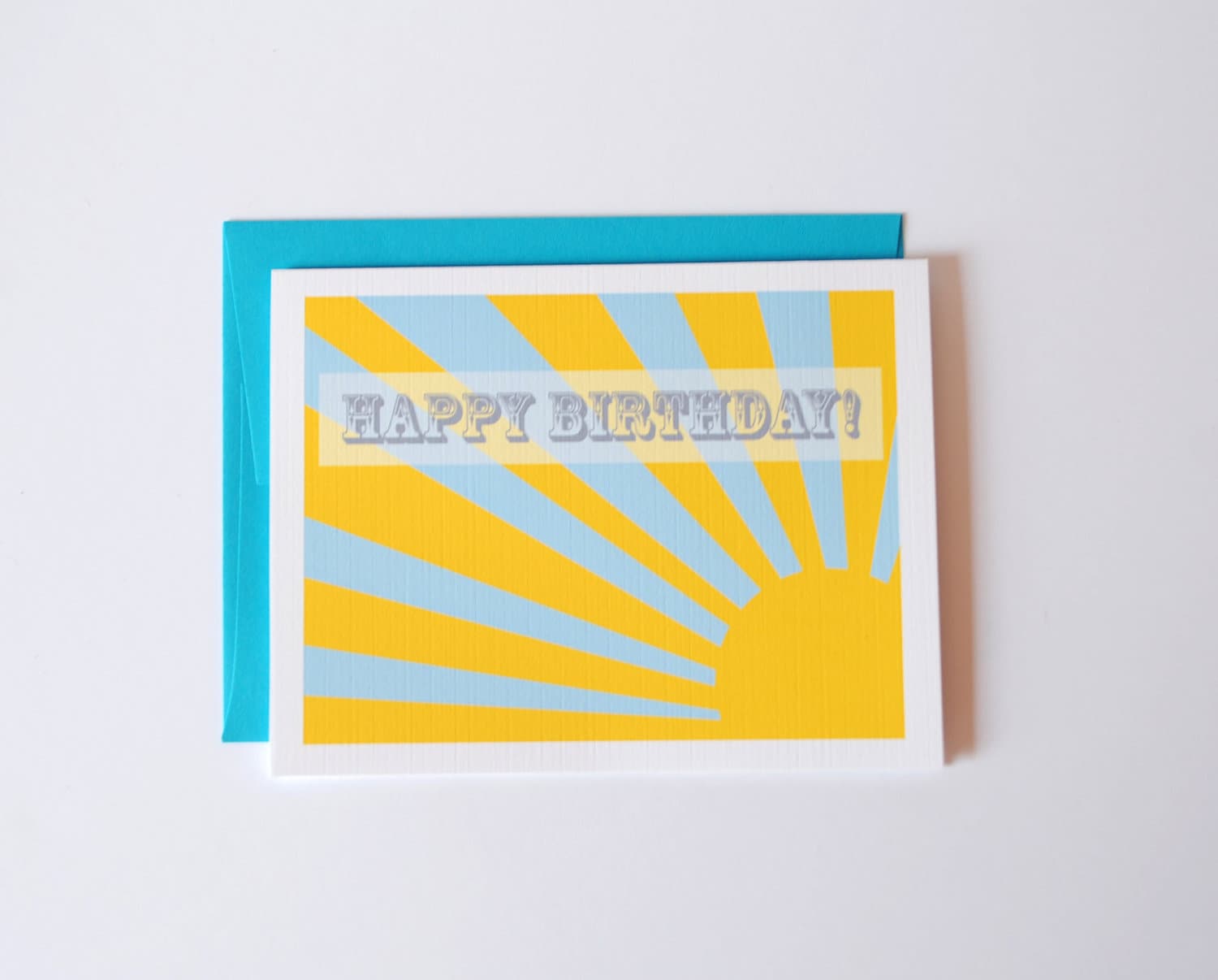
It's been a while since I've updated my shop with new card designs. I've had a lot of these cards waiting to be listed for quite some time. I get so lazy and don't want to have to edit photos and write up the listings for my shop. It always seems like such a chore compared to the rest of the things I get to do as part of owning this business. Anyway, here are a look at the new designs. Click through the photos and you'll land at the listing for the card if it's one that you've just got to snag up!

For when you're super duper sorry...


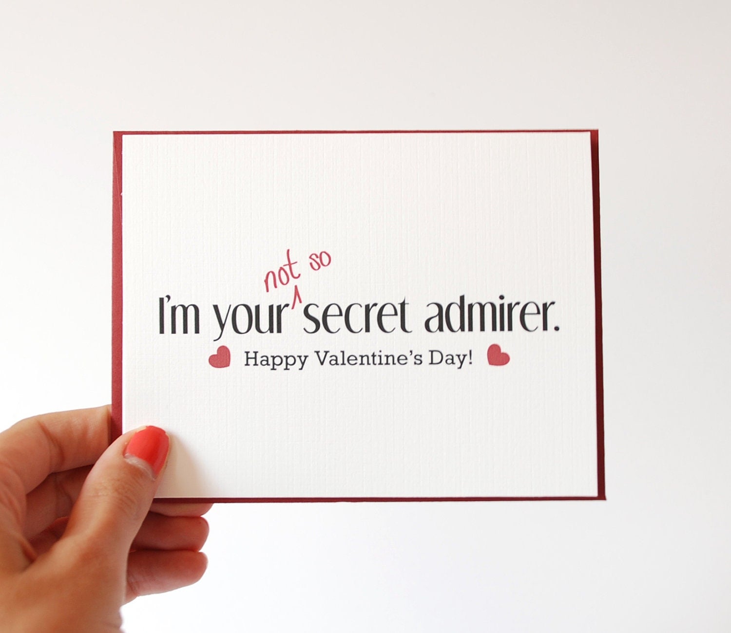
For your secret (or not so secret) crush...

For that awesometastic friend of yours...

An anniversary card...

And the Valentine's Day version too...

This birthday card was originally designed for Andrew's birthday a year ago. I like it enough that I decided to modify it and list it...

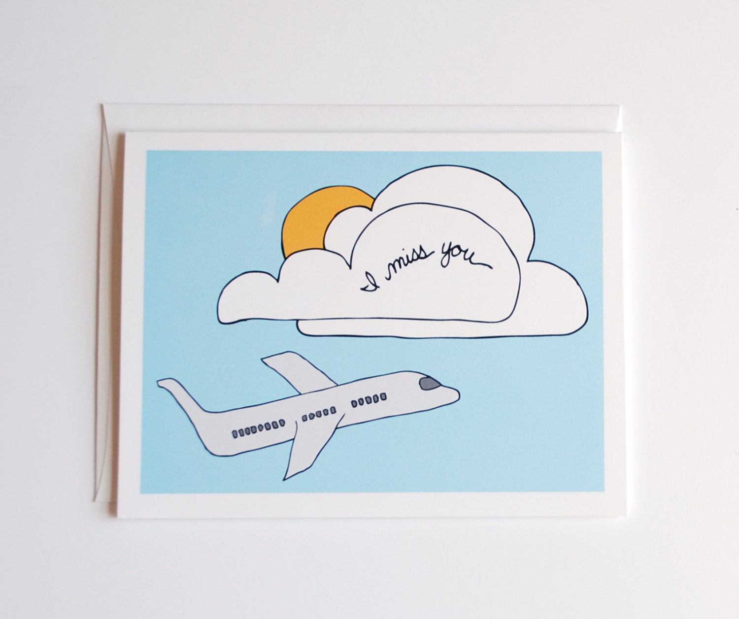
And for the long distance relationship or that person you really miss...

Now THAT is a lot of cards! Seven! I clearly felt like being a super productive person. And by felt like, I mean a bee tried to attack me while I was suntanning on my roof deck so I could not longer be lazy and needed something to do indoors. So I decided to take productive to a whole new level and start shooting new photos for some old cards. Here are a couple old, but new listings if that makes any sense. Old cards, new photos-- so they kind of feel new, you know?


I like. You like?

By the way, if you need some cards or stationery, you probably want to order soon. I'm going to be on vacay for a ridiculously long time in the near future. Ridiculously long = 16 days. I'll be putting my shop on vacation mode while I'm gone since I'll also be in the complete sticks at times with no way to communicate. (If I don't return by mid August, someone send help. A bear may have attacked me in the middle of the mountains). Freaking out a little about going on vacation mode since I've heard some bad things about doing that-- like that your shop pretty much falls off the radar and you have to start back from square one. I don't like the sounds of that. Anyone else had to do this before? Did you have problems or were you good to go upon your return?

Monday, July 9, 2012

Summer Recipe Cards

I have something to admit. It may or may not be something you have or have not noticed. I've fallen way behind on my Design a Day Challenge thingy-ma-jiggy. It sort of started when Andrew's parents were in town, and then I never really got back on track. I'm ok with it though. I've still designed a lot of stuff, and to be quite honest, I have been enjoying summer break too much to update you every single day. I haven't even had the chance to get everything in my shop yet.

It was another busy weekend. Andrew and I painted our bedroom, and we had important errands to run like going to the home brew store to get more supplies for our home brewing adventures. I had a little bit of time while Andrew was doing paint prep to list my new line of recipe cards that I had been working on this past week.

While I was brainstorming a few weeks ago with Andrew for design ideas, he had suggested a summer theme of some sort. I think his exact words were, "Draw a lemonade pitcher and a lemon and put it on a note card." In fact I have something sorta like that written down on my ridiculously long brainstorm list.

I thought it made more sense to put a lemonade pitcher on a recipe card, so I started with that idea in mind. When I drew my lemon, I decided to turn it into a lime because I like limes better than lemons. Maybe it was the fact that it was 107 degrees outside and a mojito with some fresh squeezed lime sounded really good at that moment. I don't know. But regardless, I decided that the lemon should be a lime. End result? A lime on a recipe card.

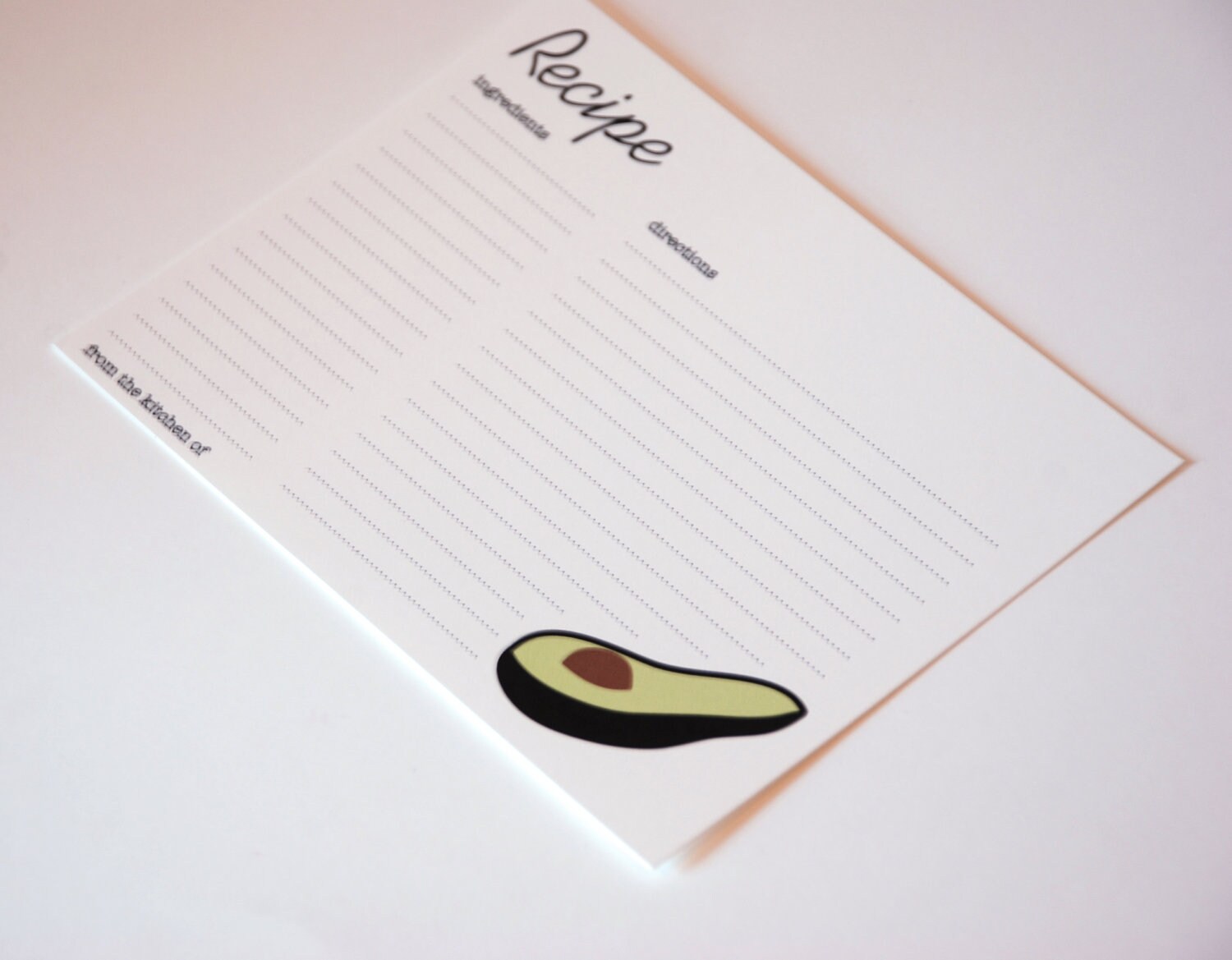
No lemonade pitcher. Ooops. I guess that's why "lemonade pitcher card" is not scratched out yet. Anyway, this recipe card got my juices flowing (pun TOTALLY intended... I'm cheesy like that) and I rehashed an old avocado design I'd used a couple years back and slapped that on a recipe card.
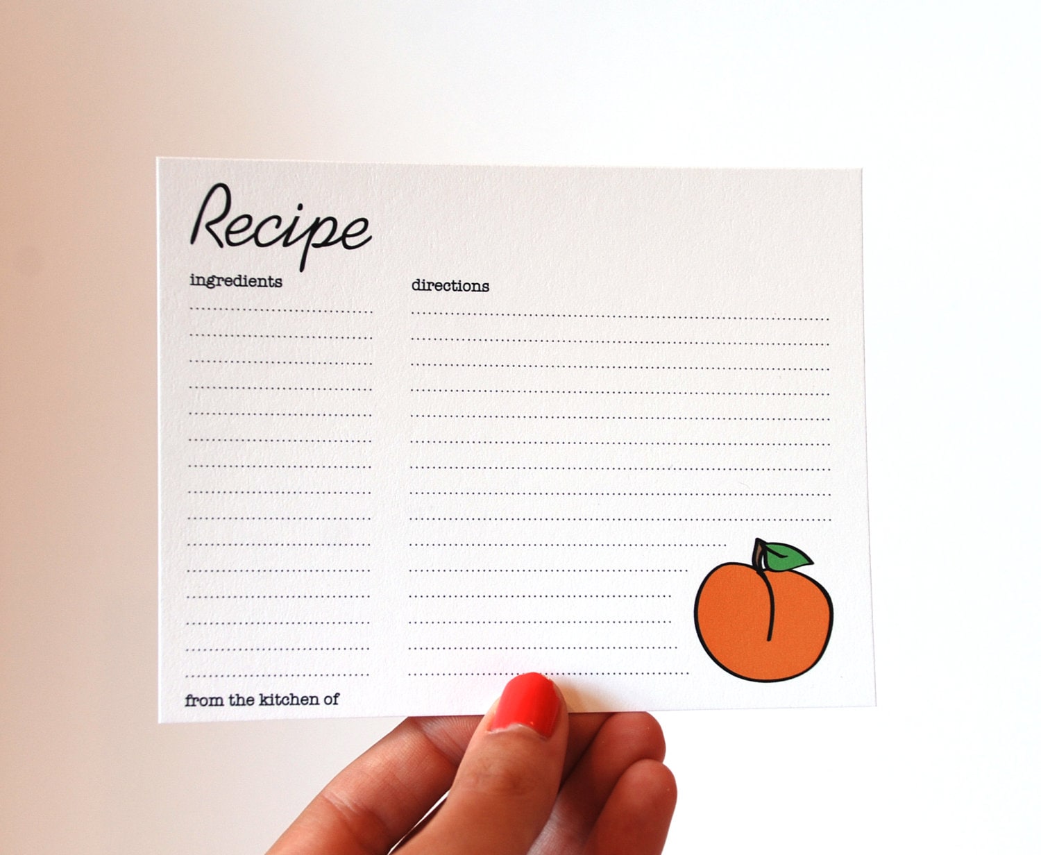
Dear old avocado then gave me the brilliant idea of creating a few more fruits or veggies to complete the scene. So in came Mr. Peach.
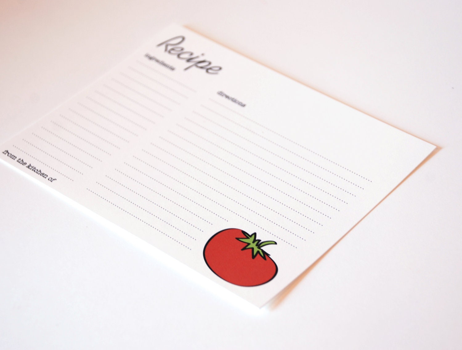
A juicy red tomato.
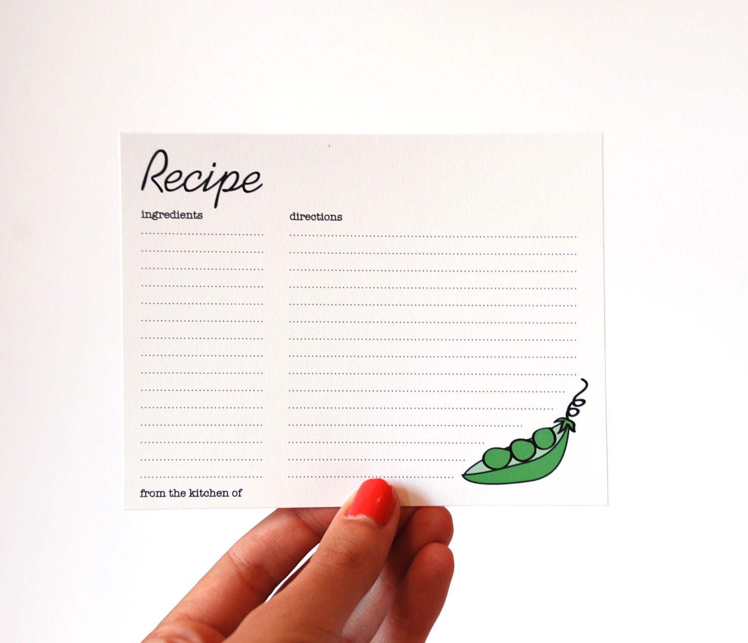
And clearly, summer wouldn't be summer without some cute little peas in a pod.
And now I have a cute little family of fruit and veggies on some recipe cards.
And in case you feel like investing in a few of these guys, you can click through the photos to be taken to the listings. I have to say, I'm quite content with my little fruit and veggie medley. I like the summer crispness of the cards if that makes any sense. Bright and simple and perfect for summer if I must say so myself.

What sorts of projects or designs have you been working on lately?
Related Posts Plugin for WordPress, Blogger...